
 Release Date: 2026.07.17
Do you access data from a monitoring network? How many monitors do you have access to? Do you feel it is representative of the state of the air in your city (or airshed or community)? AQ-NEST, using thumb rules, helps understand how representative a station or network of stations is, taking into account population density and the spread of the network. The tool helps you place monitors in the best possible design for maximum representativeness to support health exposure assessment.
Global tool repository — https://urbanemissionsinfo.github.io/AQNEST/global
India focused tool with preloaded official network information — https://urbanemissionsinfo.github.io/AQNEST
 How to Use the Tool
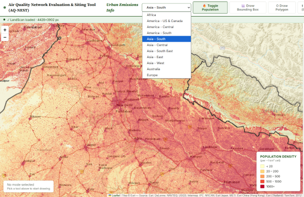
- Choose your region: “South Asia” is default. Other regions represented here are Africa, Americas (Central, South, US + Canada), Asia (Central, East, Southeast and West), Australia, and Europe (West). Regions are broken to ease download requirements and increase the processing speeds.
- The tool pre-loads 2024’s Landscan Global population raster. You can use the “Toggle Population” button to see/unsee the population heatmap. On a slower internet connection, it might take a few seconds for the browser to load it. Wait for the green bar (under url) to say “landscan loaded” with a tick mark.
- Define an area of interest: There are three ways to do this (a) Draw bounding box (b) Draw polygon (c) Upload an admin layer in GeoJSON or KML format. For phones, “Draw polygon” by placing dots and clicking “finish polygon” is the best option.
- For the area selected, the tool calculates the area defined (km2) and the population size. The tool then uses guidelines (CPCB 2003) to calculate the minimum number of monitors required.
- You have two options to place a monitor network
- Choose number of monitors in your network, click “Start Placing” button, and place dots by clicking inside the map.
- You can upload a GeoJSON (points layer) of known or planned stations. All the stations that fall inside the area defined will be placed on the map.
- You can also manually move the stations on the map after placing them.
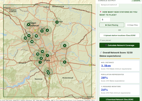
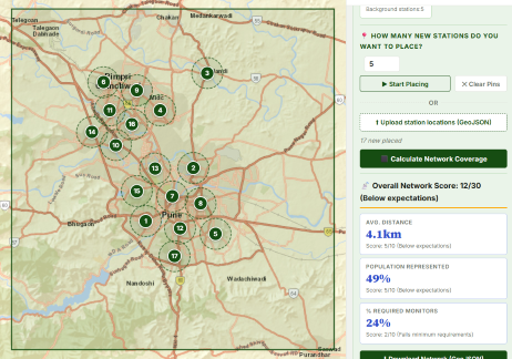
- Click on “Calculate Network Coverage” button: This will present three metrics along with the overall network design score.
- Average distance between the stations in the network (thumb rule distance set between 2-3km)
- Population represented by the network placed (thumb rule of 1km radius for densely populated areas and 2km for the rest is used)
- Percentage of minimum required monitors
- Use “Download Network geojson” to save your design (to upload next time or for future use)
- Use “Clear” to restart; “Clear Pins” to restart placement of the stations
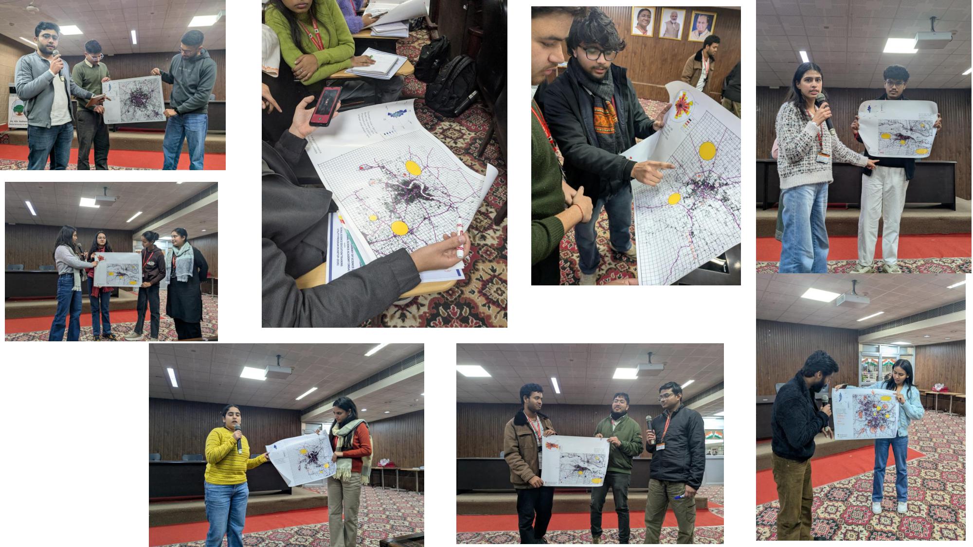 This is designed as an educational tool, to understand the concepts and needs of a good monitoring network design; and support researchers and policymakers with how best to fill the missing spatial gaps while maximizing the exposure coverage of the network.
This tool is used to evaluate the representative strength of the network designed by the participants during our classroom exercises (more on these interactive exercises is here).
Known limitations are the following
- The tool does not differentiate between a regulatory grade or a sensor monitor
- The tool does not automatically design a solution for you — the idea is play with the placement to maximize the benefits of the intended use of the monitoring data (aka. health exposure)
- City airsheds are not pre-defined — some example airsheds can be downloaded here for Indian cities.
- Existing monitoring network information is not available. User can place points on the map to the nearest locations to evaluate or have the locations file to upload (as geojson) to evaluate. Only India’s official monitoring network is available as default (on India only version). Sensor groups like AirGradient, AirQo, and Aurassure and portals like OpenAQ, allow downloading locations information.
Calculations
Here are the guidelines and thumb rules used for evaluating the network design
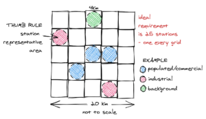
- For spatial coverage, the number of monitoring stations/sensors in the design is compared to the minimum number of recommended stations (calculated using the CPCB guidelines – see the reference material below)
- For heterogeneity of the design, the average distance between the stations (the shortest distance to the nearest station) is used. Thumb rule recommendation is 2-3 km.
- For exposure coverage, the population represented collectively by the stations is compared to the total population of the area selected for the exercise. The population represented by the stations is calculated using the thumb rule that a station/sensor is representing the population and activities with in a radius of 2 km from its location. In the denser parts of the airshed, this rule is not applicable — for pixels with population density > 8000 inhabitants/km2, this factor is reduced to 1 km.

Network Score
This is a subjective assessment introduced to compare existing, planned, and enhanced (hybrid) network designs using the above three metrics. The end game is to maximize the representativeness of the design to feed health impact assessments.
Average distance between stations (Max 10)
- < 2 km = 10
- 2 to 2.5 km = 9
- 2.5 to 3.0 km = 8
- 3.0 to 3.5 km = 7
- 3.5 to 4.0 km = 6
- 4.0 to 5.0 km = 5
- 5.0 to 6.0 km = 4
- 6+ km = 1
% population represented (Max 10)
- 0 to 10% = 1
- 10 to 20 % = 2
- 20 to 30 % = 3
- 30 to 40 % = 4
- 40 to 50 % = 5
- 50 to 60 % = 6
- 60 to 70 % = 7
- 70 to 80 % = 8
- 80 to 90 % = 9
- 90+ % = 10
% of recommended # of stations (Max 10)
- 0 to 10% = 0
- 10 to 20 % = 1
- 20 to 30 % = 2
- 30 to 40 % = 3
- 40 to 50 % = 4
- 50 to 60 % = 5
- 60 to 70 % = 6
- 70 to 80 % = 7
- 80+ % = 10
Scores for individual metrics mean
- 1 to 2 — Fails minimum requirements
- 3 to 5 — Below expectations
- 6 to 7 — Meets minimum requirements
- 8 to 10 — Meets requirements consistently
Collective score (Max 30)
All three metrics are given equal weightage
- 1 to 7 — Fails minimum requirements
- 8 to 15 — Below expectations
- 16 to 23 — Meets minimum requirements
- 24 to 30 — Meets requirements consistently
Reference Material
- Primer on air quality monitoring (available in multiple Indian and International languages)
- Primer on what is source apportionment
- Guidelines for minimum recommended stations
- 2003 – guidelines for ambient air monitoring (See Table 4.1)
- Technical specifications for reference-grade stations (India)
- Working Papers (access here)
- Series #64-2026: Reading the Air: A Practical Guide to Air Quality Data and Its Uses
- Series #60-2025: Statistical Ambiguity: Was Delhi’s air quality in July 2025 the best in a decade?
- Series #57-2025: How to visualize ambient monitoring data
- Series #48-2024: Data from small monitoring networks is unreliable: Case of Indian cities
- Series #46-2021: 10 Frequently asked questions on air quality index (AQI)
Example Screenshots from the tool
Example: What happens if we shift some official monitoring station locations by a few km in the Pune airshed
 |
 |
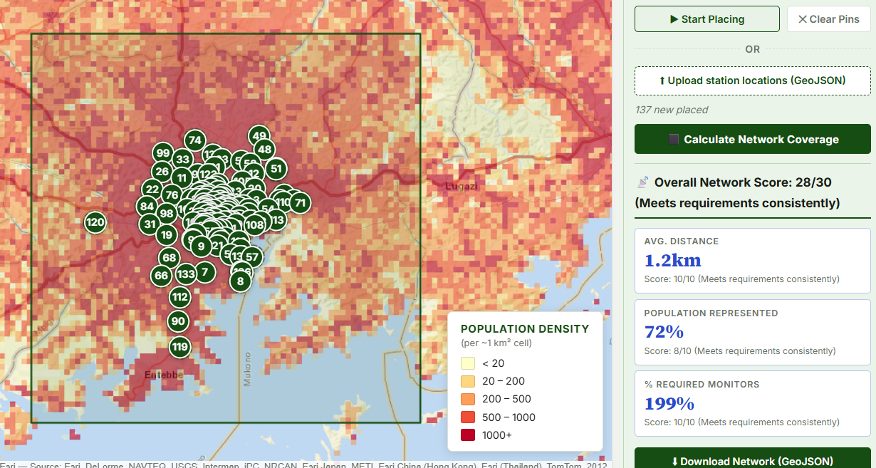
Example: What happens if we shift 10 monitoring stations from overlapping locations to the outskirts in the Kampala airshed (Data file from AirQo, Kampala, Uganda)
 |
 |
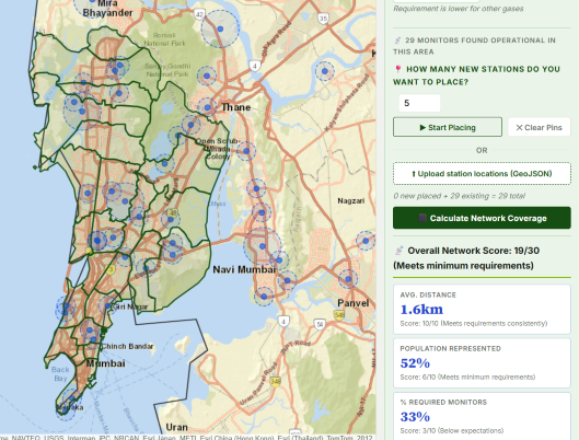
Example: What happens if we add a denser sensor network over the Bombay Municipal Corporation (BMC) (Data file from Respirer, Pune, India)
 |
 |